
On Illustrating the Discussing Disability in Dance Book Project
BY LIZ BRENT-MALDONADO
Liz Brent-Maldonado is the illustrator for the Discussing Disability in Dance Book Project. She is a visual artist, writer, and educator based in San Francisco, CA. Here, she discusses how she went about creating a color template and style for the project, how she researched each dancer to find the image that would inspire her illustration, and how she balanced the aesthetics of portraying disability.
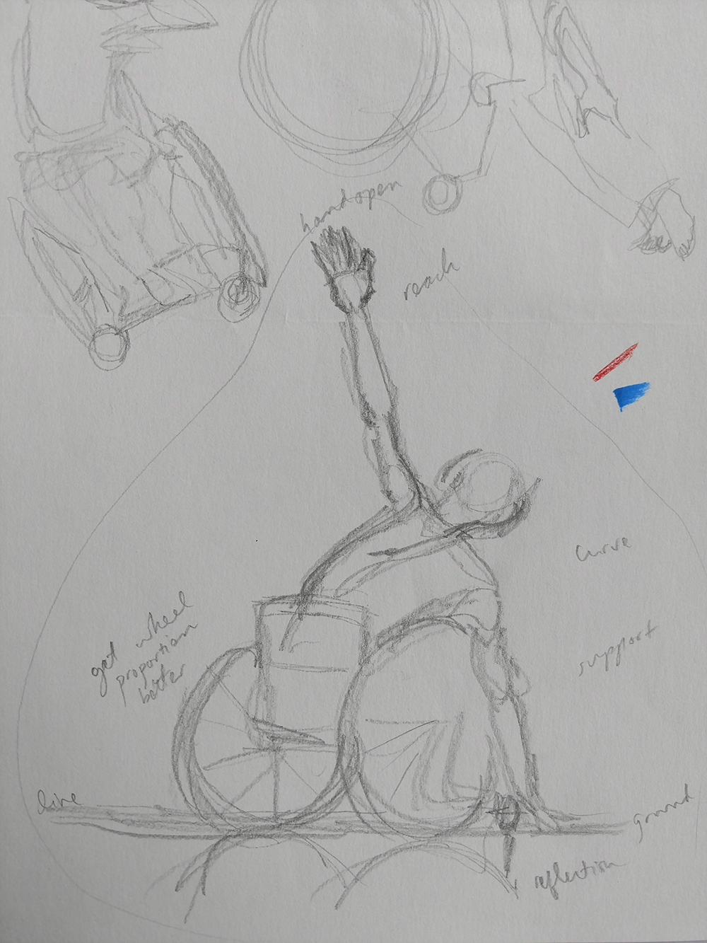
Image description: Pictured is a rough sketch of a person in a wheelchair with one arm reaching toward the ground and another arm reaching above. Notes and other ambiguous sketches fill the page.
~~
How I Got Involved
The short story of how I got involved in the Discussing Disability in Dance Book Project is that Emmaly Wiederholt is one of those people who I trust completely when it comes to artistic and editorial vision. (And life in general.) When she asks me to be a part of a collaboration I say YES.
Emmaly and I became friends after meeting each other in the Bay Area performing arts community when I was working at ODC Dance in San Francisco. Waaaay back in ye olde 2014, we collaborated on the “Men Who Dance” interview and art project, which I spearheaded and illustrated, and which she edited and published online. Since then, we’ve collaborated on several projects for Stance on Dance. I’ve watched Emmaly build an incredible platform with Stance on Dance for content that I’ve not seen anywhere else.
Maybe most importantly, the mission of the Discussing Disability in Dance Book Project reverberates with me, as I believe strongly in elevating diverse artistic experiences. If I can support an effort to do that in any way, I will.
Finding My Process
In terms of my process illustrating the project, “time-consuming” is definitely a phrase that comes to mind! Back in 2018 when I started illustrating this project, I assumed we would be finished in six months or so. Well, it’s 2021, kids! Like most (every) project I’ve undertaken, it has required more time and energy than I ever expected. I was excited about it because it had a solid mission at its heart, seemed like a chance for me to grow artistically, and I could create pieces for an illustration portfolio.
The first part of this project was deciding on a style and a palette. I was nervous about my style changing over time as I drew these illustrations as well as staying consistent in the overall look. I created a set of possible approaches, which helped us discuss and narrow down a color palette and style to tie together the project. My style has evolved during this project, but because early on we chose a look, it has helped contain some of the natural evolution.
The colors of red, blue, and gray were essential to keeping consistency. I also committed to a certain level of realism because I didn’t want to hide any aspect of disability or to use any abstract qualities to promote a sense of energy only and lose the physicality inherent to dance. In general, I use gray for clothing to put more emphasis on the form of the body overall, and less on costume or fashion. I use red for a feeling of physical energy, and blue for tools or technology.
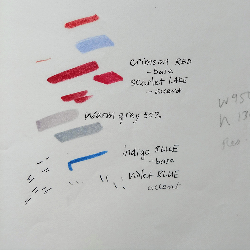
Image description: Pictured are color swatches of different reds, blues, and grays.
In terms of the process for each illustration, I read the interview and jot down any quotes that stand out to me that I think should be featured or integrated somehow. Then I do rough sketches and start planning the final image. Each artist interviewed provides images of themself they wanted us to use for reference or as part of our social media, but I also rely heavily on my own research online. Sometimes, I reference performance video footage or the artists’ websites and social media. I can never predict which image will be the one that leads to the final illustration. It usually just “feels right.”
*Art Nerd Alert* – Heavy on the Process Details Here
For these illustrations, I sketch in pencil on what’s called “marker rag” paper. I like this paper because it is semi-transparent and allows markers and the layers you can create with markers to shine or even glow a bit, rather than look flat or bleed out. One of the scariest steps in my process is erasing the pencil sketch lines and going in with markers. I’ve moved away from solid black lines for edges; I like a softer edge, so a combination of pencil and marker is where I’ve landed. But it seems scary if you were to observe my process because it looks like I’m completely erasing a finished sketch!
I use Prismacolor markers primarily, but I also started experimenting with Touchnew markers in 2020 because I like their range of skin tones better. I always double-check the marker color on a scrap piece of paper before applying it to the illustration.
When finished with the marker work, I step back or even walk away from the illustration for a couple of hours. Then I come back to see if any adjustments, additions, or corrections are needed. I may go back in with pencil if I want a little more definition in places.
The early illustrations included ink I applied with calligraphy pens for the featured interview quote, the name of the artist, and my signature. I moved away from this in 2020 and started using regular pigment pens for anything in black. This shift occurred because liquid ink in calligraphy nibs can be challenging to control and I had ink splatter ruin a finished illustration!
When finished, I scan the illustration and do color adjusting in Photoshop for saturation and contrast so the colors pop on a screen. I also adjust the size for website scale.
Final, Final Steps aka Feedback
One of the hardest things about this project has been feedback from the dancers and choreographers I am drawing. Clearly, if you want to do illustration work, you are more often than not collaborating with others (the writers, editors, etc.), so a thick skin and willingness to make changes is required. Luckily, I had editors who were my bridge and communicators of all feedback from the interviewees. This helped a lot as they could make requests diplomatically as needed.
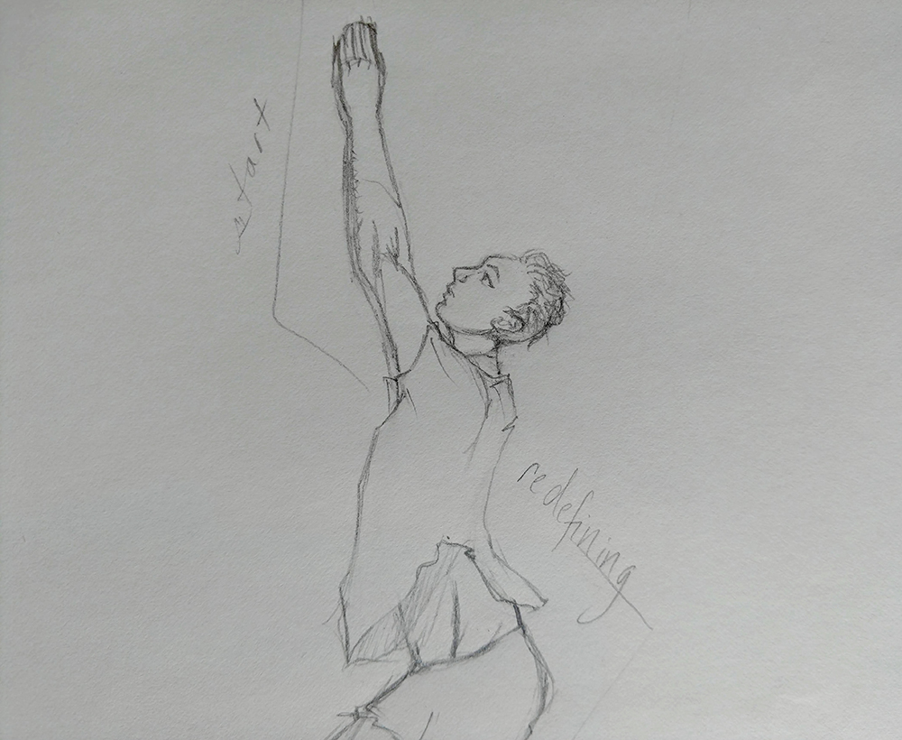
Image description: In this sketch, a dancer is drawn from the side with both hands pressed against each other and raised above their face.
To be clear, most of the artists we interviewed love my illustrations and had no feedback! Or, they just wanted to add or adjust minor details. But a few artists had very specific feedback that meant I had to start over and create the illustration anew. And not being a digital artist, this was very time-consuming! (That phrase again…) But the time investment has been worth it to be respectful of my fellow artists. And, over the course of the project, it has led to a better understanding of my own limits and boundaries as a visual artist.
On the flip side, I did sometimes wish I had more interaction with the artists we were interviewing. I had only one in-depth conversation with an interviewee because I had a question about a photo he had submitted for me to use as a reference. It was such a lovely conversation and it helped me so much.
Balancing Acts
The whole project has been a tricky balance of overlapping art forms. Dance, photography, video, written word, and visual art are all stand-alone forms in their own right. I didn’t want the illustrations to look too much like copies of photography, even though I was often going for accuracy to the point where a few of the illustrations are very close to the reference photos of the dancer. At times I did feel the need to cite or reference photographers or other artists if the image was very close. But maybe I should have been more consistent and done this every time. I’m not sure. Capturing movement and the energy of dance in a static form is very tough. How is an illustration different than a photo? What energy is captured in a way that a photographer or videographer does or doesn’t capture? These are questions I am still grappling with.
I am also very grateful that prior to starting this project, back in 2015, I took a figure drawing course by San Francisco-based teacher and artist Michael Markowitz (of 23rd Street Studio). One of the big takeaways from that learning experience was how to see what is in front of me as I draw, to focus more on capturing what is actually there, and to be aware of a tendency towards overcorrecting for aesthetic bias.
This approach has served me well when drawing the human body because no human body is “perfect.” I wanted to be both sensitive and accurate when creating these illustrative portraits, and bias shows up in odd ways. For example, sometimes my drawing would be off in terms of body proportions because as I was drawing, my hand was “normalizing” body proportions without even realizing it. Also, I don’t think of myself as a very technically-inclined artist, and drawing things like wheelchairs requires a level of attention-to-detail that challenges me but I also find myself enjoying.
How has this project changed my perspective on disability and artistic journeys?
Looking back over the past couple of years, I do think my comfort and confidence with these artistic balancing acts have improved. This journey has also convinced me to finally start trying out digital art creation for the sake of saving time when it comes to making edits in the future (we’ll see if that proves to be true!).
This artistic journey has also led me to reflect and write more about my own career in dance, my body issues, and my experience living with a rare neurological disorder (Visual Snow Syndrome) in new ways. I am trying to acknowledge my own challenges in a way that’s kinder to myself but also authentic. And it’s no surprise that I’ve grown in these directions as awareness, acknowledgement, and authenticity are at the core of this project.
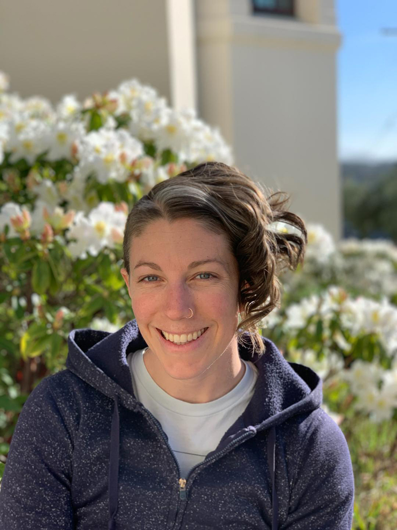
Pictured: Liz Brent-Maldonado, Photo by Shane Brent-Maldonado
Image description: Liz is pictured from the chest up smiling. She is wearing a zipped up hoodie and her hair is short with a curl to one side. A flower bush is blurry behind her.
~~
To learn more, visit stanceondance.com/discussing-disability-in-dance.
To learn more about Liz’s work, visit her Patreon at www.patreon.com/sparklevision.